HOME | DD
 agnes-cecile — tomorrow's final crash

Published: 2012-07-26 13:56:45 +0000 UTC; Views: 69979; Favourites: 4064; Downloads: 1345
Redirect to original
Description
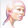
edit: new better pic
tomorrow's final crash will be easier understanding the movements of things
( try to see not a blouse in the blue form on her, but try to see it as a shadow of someone else on her. Can you do it? no one?


 )
) watercolor, acrylic, pencil and pen on watercolor paper (300g)
45,5 x 61 cm
Related content
Comments: 201


This is beautiful. I can never applaude you enough. The resemblence of the night sky that drifts across her face is so subtle that it creates a massive impact. Although, I love the slight curls of her hair, as if they just rest on her head without a care in the world, because the detailed design in the centre of her body seems to be the obvious main focus here. The texture seems to reiterate her facial expression: as if she is lost, and there is nothing she can do, almost just wondering now, like the open sky/space is. It's magical in some way and I love it. Well done!
👍: 0 ⏩: 0


Compared to your other works this one is different...beatiful and great technique but the subject's emotions are not flowing out of the eyes...in this image it is actually flowing from deep witihin. Very good flow of transparency from the subject but still keeping very good shading within the areas of darkness along the neck and face. very good mixture of colors and geometric shapes, sharp and painful deeply within her body. Usually I see an emotional sadness but in this image I don't see such sadness but more of a deep darkness that is numbing. Your art is just very good!
👍: 0 ⏩: 0


Maybe it's because I live in America, but what I see is an abused woman with the shadow of her abuser cast over her. She has a blankness in her eyes that we've seen way too many time in the media, be it drugs or abuse.
In my eyes it's a very powerful piece, especially since she resembles the wife of my best friend. Who is not abused by the way, but it tugs at me even more due to the resemblance.
I believe this is your most socially powerful piece. The color pallet was used perfectly, the tilt of the protagonists head, her vacant expression. I could go on and on. I would say the only draw back I can see is the geometric shapes in the shadow, I just don't understand why they are there.
Powerful, powerful piece.
👍: 0 ⏩: 0


I love your Works! I think the way you work with the transparency, fluidness, light and brightness of the colors is natural. I love that! The effects of subdued and diffused light transcends to volume and adds another dimension to the 2D artwork.
The lines are fluid and organic what means discipline and daily exercise. The execution is excellent and this piece has also graphic quality.
Your artwork express symbolical value and metaphores and i like that too. They display a spectrum of mental and emotional experiences what is very important and the fact of be purposely partially finished, stresses this idea.
Thanks for share your art.e.deviantart.net/emoticons/s/s… " width="15" height="15" alt="


👍: 0 ⏩: 0


I have certainly seen this style of work before, however never displayed in this manner as you do so. What you were thinking I can't comprehend but I can say that some of your thoughts were translated onto your piece and spoke boldly.
The emotion transcribed on the face as well as the way you placed your colors on the shirt and throughout the face (the touch of pink on the cheek and the darkened peach on the shirt had to be my favorites) just make it a picture to stand and watch, waiting for the deep and almost sad looking eyes to blink or shed a tear, or perhaps the galaxy on the shirt to shift a bit. The subject comes out of the piece, as if to separate itself but has its hair and sweater tying it back to the paper.
Overall, I think it's a breathtaking piece to say the least. I think everything about it is perfect in its nature and your technique could not have been more well applied. You make your piece stand out diversely from others with the same process by applying your well formed technique and your most innovative idea. It's been my pleasure to critique your work.
👍: 0 ⏩: 0


Somehow all of your work just takes my breath away with its originality and obvious talent. I love how you manage to include so many different aspects in one piece. It has geometric abstract and contemporary design while also including realism. Another aspect of this piece I like is how you seem to capture a mood and make this piece reach out to each person in a different way. I absolutely love your work and am actually saving to buy some. I wish I could work with paint the way you could. Keep up the good work I love it all!
👍: 0 ⏩: 0


As usual with your artwork, the technique is stunning. The colors are absolutely beautiful, and I love the stars/constellations. For vision and originality, I give you a 5/5 because it really is a great idea. I only have one problem with this piece. It is very difficult to see the shadow on her. If you hadn't mentioned that that's what it is in your description, I wouldn't have known. Instead, it looks as if you simply stopped painting, and the entire work looks a bit unfinished, which lowers the overall impact. However, painting the shadow of one person on another seems like something that would be incredibly difficult to do recognizably, and I think you probably did the best anyone could do.
Other than that, the painting is absolutely gorgeous. I especially love the girls eyes. They hold so much meaning and emotion. Overall, a fantastic work, especially for such a difficult concept.
👍: 0 ⏩: 0


So before I signed in today I saw this image, and when I did sign in it somehow left the front page and I went nuts trying to find it again.
And for me to have something to catch my attention off the front page is saying something only because I'm more concerned about seeing what all my watchers have put up, and what new notifications I might have.
As an avid art lover, and a bit of an art dabbler myself I have to say that you and only one other person on DA have absolutely captured my heart with your use of water color. It's like a forbidden medium to me, one that I struggle with because you have to build from light to dark. I'm the sort of person that paints my darkest colors first then add light to build from there.
This is amazing, and beautiful.
It's very spiritual too, you can see the almost longing look, and the stars....omg the stars just make it. Great job.
👍: 0 ⏩: 0


I like this first off because it's not some beautiful young twenty-something girl (that we all love to draw and paint), its a beautiful, yet wise and experienced older woman.
Her face looks real, I like how the paint made a highlighting effect on the left side, giving her cheekbones and a texture that tells of a face in the sun (at least to me). Her eyes are at first glance, sad, but her expression tells me that she knows something that makes her sad. Because of the sky-space pattern on her clothes (an apron? I can't tell), I feel like she knows of the world's end.. also probably because the title is "tomorrow's final crash". The white prism-like shapes on the night sky background are also interesting. They give the picture a science-y or math-y touch.
The title is important in interpreting and thinking about this picture. In the literal sense, you cannot see a crash in the painting, but the crash is what SHE knows is coming. This painting is amazing, I can't stop looking at it and wondering. What does everyone else feel when they look into her eyes?
👍: 0 ⏩: 0


I am a huge fan of your work. In all your paintings, including this one, you use very loose brush strokes that have amazing results, along with the finishing details. The details of the face are precise, and as the water color fades, i like the look of the star constelations. I've also noticed that the majority of your paintings have bright colors of reds, blues, etc.... I like that you kept the color theme to a minimum, to me it gives the less is more effect. All around i think this is a really cool painting, cant wait to see more....
👍: 0 ⏩: 0


I love your style of watercolors/acrylics and the use of white pen and pencil to make a piece, and once again, you've proven that you don't have to fill the lines to make something beautiful. I like the the colors you used, they remind me of space with the white specks here and there. Your use of skill in this piece-- and most of your pieces-- is apparent in the mixing of your colors so that it all just IS. None of the hues you used stand out as if they're not supposed to be there.
I really enjoyed this picture.
~Z e.deviantart.net/emoticons/let… " width="15" height="15" alt="


👍: 0 ⏩: 0

I love this! I instantly recognized the shadow as a human, a man, and although I see that normally his proportions would be wrong, his shadow would be slightly morphed because the woman is not a flat surface. This painting seems to be about a destructive relationship between a couple or domestic violence, as the shadow's pose seems quite imposing and intimidating and her expression seems fearful.
👍: 0 ⏩: 0

I just love what you're doing with the shapes and the colours, and the fact that you have a real talent for this. Keep up the good work!
👍: 0 ⏩: 0

I like it. It reminds me of broken, decaying wall plaster, with layers of different colors.
👍: 0 ⏩: 0

( try to see not a blouse in the blue form on her, but try to see it as a shadow of someone else on her. Can you do it? no one? )
I COULD I DID!! Great job! how did you do the white lines thing?
👍: 0 ⏩: 0
Very cool painting. I love the addition of the geometric shapes at the bottom; it definitely adds to the constellation impression.
👍: 0 ⏩: 0

Very pretty *U* looks like your looking into another galaxy
👍: 0 ⏩: 0

I see the shadow. The pose of whoever is casting that shadow is bizarre. I like it. If anything, I would have altered the shadow. Beginning with its neck. It needn't be human, per se, but it seems like you wanted it to be.
👍: 0 ⏩: 0

I can see it 
👍: 0 ⏩: 0

The first time I looked at this picture, I thought the blue part was the back of someone's head, slightly turned towards me so I could see the jaw, and then I looked again and i was like 'or is it a scarf' and then I looked at the description and I was like win! ...and now you know...
👍: 0 ⏩: 0

I see the other person in her... the other person almost overwhelms her
👍: 0 ⏩: 0

I just love every single peace of your work
You inspire me.
👍: 0 ⏩: 0

I love the shadow inside the portrait!!! such a beautiful and creative concept! and expertly executed! outstanding as always!!!!!!!!!!!
👍: 0 ⏩: 0

It's wonderful
She reminds me of Trinity from Matrix series
Beautiful
👍: 0 ⏩: 0

This is so beautiful, the way you use water paints is amazing, everytime i see your work i feel so inspired <3.
This picture reminds me so much of skyrim
👍: 0 ⏩: 0

It looks like constellations in the sky at night. Amazing! Very beautiful! Stunning!
👍: 0 ⏩: 0

I see the shadow! The work is just WONDERFUL! I like your art so so so much!!!
👍: 0 ⏩: 0

Love your work! do ou have video of making this one?
👍: 0 ⏩: 0

E' da un bel pò che guardo i tuoi lavori , diventi sempre più brava e vedere opere di questo calibro in Italia fa sempre molto piacere , Complimenti ...
👍: 0 ⏩: 0

this is truly mesmerizes me...I've been searching for something like this for a very long time. this brings inspiration and I don't know how to explain it...just awe. thank you.
👍: 0 ⏩: 0


soo pretty though.... ^^ i love how the blue looks like the night sky and you can just stare deep into it with the same feelings you get when you look into her eyes
👍: 0 ⏩: 0
| Next =>


