HOME | DD
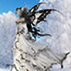
 Azalane — Lucie the Fay

Published: 2012-07-10 18:10:19 +0000 UTC; Views: 792; Favourites: 32; Downloads: 15
Redirect to original
Description
I did this art piece for my dearest mother, Lucie. She lost her boyfriend of the last 15 years earlier last month. She has ups and downs and the mourning is very hard for her.I had the idea to do an illustration that she could see every day so she would remembers that she's not alone and my brothers and I will always be there for her.
I'm very proud of this artwork. I thing that it's the best I ever did. It's the first illustration I ever give to someone and it's a real joy to give it to my mother.
She cried, I cried and she was really happy!


References:
: for the first idea ([link] )
: for the stained glass
Made with:
watercolor, white opaque gouache and Indian ink on a 10"X14" 100% coton 140 lb's Arches sheet.
-All rights reserved © Maya Bernatchez 2012
*** You are not allowed to use my work unless you have my written consent. Thank you!
Related content
Comments: 34

Thank you! I used a stained glass as a reference. I was pretty happy of the result too
👍: 0 ⏩: 1

ohh coool!! 

👍: 0 ⏩: 0

This is very pretty! 
👍: 0 ⏩: 1

Thanks for the comment! 
👍: 0 ⏩: 0

oh she looks so pretty 
this would be a perfect drawing to add to my fairys group
this is really nice keep it up
👍: 0 ⏩: 1

Don't hesitate to ask me other artworks, I think some of them could interresting you!
👍: 0 ⏩: 1

oh cooli 
👍: 0 ⏩: 1

Great! I'll submit them today ^_^
👍: 0 ⏩: 1

Here's the critique you've requested, Maya!
Let's start with an overall view. The colours mostly fit well each other, maybe just the stained glass part could be a bit paler, because it distracts the viewer from Lucie. The golden stains and the general patchy structure of the blue parts are nicely done. I can see that you vary the thickness of the linework, but try making it more reasonable - thicker lines for important things and the foreground's outer lines (in this case, Lucie), thinner in the background. This would make your fairy stand out easily.
You've said before that you were working on getting rid of manga manner. I've just remembered about a nice tutorial that could interest you, and you can learn some anatomy from it, too: [link] As you can see in this tutorial's description, it's just a small part of a huge material, I recommend taking a look. Also you mind find helpful these ones: [link] [link] [link] In my opinion you've already managed to get rid of it in a huge part (: As I've said before, taking a lot of sketches from real is a very good idea, it helps in learning not only anatomy, but also you can learn how to put shading.
Her wings are painted very nicely, especially the lower part is accurate to how a butterfly's wing is built. Have you thought of putting a slight hint of the background, to make them look more ethereal?
On the anatomy now (with the addition of what I've already written). Two things that catch my eye especially are: her nose and shoulder. About the shoulder - its top should make a one curved line with her back, "separating" it from the rest of the body. On the other hand, even though the pinky stain on its top is rather needless, the shading on the shoulder and arm is put very well (: An important advice - every line you draw or paint on a body, especially on the face or neck, make the character look older. That's why making those lines on her neck not so visible would be a good idea.
Her dress. I'm not entirely sure what was your idea about it, but I like the lace. Despite this, if you wanted to make it look like made of leaves, than it's close (: If not, then take a look at these tutorials: [link] [link] [link]
In the end, I'd like to give you some tips if you'd like to train from those tutorials (: First of all, buy a thick sketchbook and a 2B pencil (it's the most optimum one - can make both very light and very dark lines and it doesn't smudge as much as those softer pencils). Do at least 4-5 sketches daily and as much from real reference as you can (photo references are flat and it's the main diffrence that makes them much less useful than living real life references). Observe a lot, consciously - notice the ways other creators do things that you wonder about.
But to sum the drawing up, it may have flaws that I mentioned, but it's not serious enough to make you worry. You're a very promising artist with a big potential, just you need some training (:
👍: 0 ⏩: 0

lovely! 
👍: 0 ⏩: 1

Thank you!
Those parts are my favorites too!
👍: 0 ⏩: 1

Oh mon dieu! C'est absolument beau! J'ai pas de mots... J'adore le style vitrail que tu a paint dans le background. Lucie la Fée est très belle aussi, surtout ses ailes et ses magnifiques yeux expressifs. Les meilleurs cadeaux, c'est quand on les offre à nos mères...
👍: 0 ⏩: 1

Wow! Merci beaucoup!
Ça me touche beaucoup ce que tu dis. Je suis très fière de cette illustration et je eu un beau sentiment d'accomplissement comme je n'ai jamais eu avant. Ça m'a comblé de joie et de fierté d'offrir ce cadeau à ma mère.
👍: 0 ⏩: 1

Je comprends ce que tu veux dire. Je voie par ta description qu'elle a apprécié le cadeau à sa juste valeur... KVoici ce que j'avais offert à ma propre mère: [link]
[link]
👍: 0 ⏩: 1

C'est très jolie! J'adore ton vase
👍: 0 ⏩: 1


👍: 0 ⏩: 1

Thank you very much, Ashleigh!
👍: 0 ⏩: 1


