HOME | DD
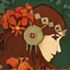 Bit-sinna — Pale Imitation

#digitalart #digitalpainting #golden #mirrorimage #redhaired #twins #autodesksketchbook #laurels
Published: 2015-10-14 18:08:04 +0000 UTC; Views: 607; Favourites: 40; Downloads: 0
Redirect to original
Description
Besides mentions of their long necks, any constructive input is much appreciated.Available at Society6 .
In progress:
Stock that inspired this:
Related content
Comments: 21


Hey! Thought I'd leave it here instead of in correspondence.
First of all, I have to say one more time that I really like this portrait. My favourite parts are the color combo, the touch of blue in the background, the way you shaded the red hair, the clean, smooth outlines.
There is a couple things that I think are major and a few that are pretty minor.
First, the major ones:
- First thing is the value balance - your shading is pretty light and the lack of contrast makes it look quite flat and unfinished. I think if the shadows were a bit darker and there were some very light highlights for example on their noses, cheekbones, lips, etc it would look better, and the figures would stand out much better against the background. And vice versa, some parts can be a lot darker such as the nostrils, the eyelashes, the opening of the ears.
- Second thing is that the two figures look inconsistent with each other - the right one looks rather unfinished compared to the redhead, especially in terms of the crown and hair. I'm not sure if that's intentional but for me personally it would look much better if there was the same level of detail on both.
And a few minor things:
- I'm not going to mention the length of the necks e.deviantart.net/emoticons/let… " width="15" height="15" alt="


- You could consider their ear placement a bit. I think they should be a bit closer to the eye and a bit higher, too - if you run a horizontal line that's perpendicular to the profile line the bottom of the ears should line up with the bottom of the nose and the top should line up with the corner of the eyes.
- You could also consider adding some more colors to the skin - such as blush color on the cheeks and noses.
- The left portrait looks quite androgynous - is it a man? You could improve the masculine look by giving him a stronger jaw, thicker eyebrows (also why not white eyebrows to match the hair?) a straighter nose.
These are my two cents. What do you think?
I find the piece to be very interesting and appealing and would love to see it again if you decide to make any changes.
👍: 0 ⏩: 1

Thank you for your wonderful critique! And thank you for being so concrete, I've never been fully satisfied with this piece, so I really look forward to working it over again after having read your thoughts.
The figure on the right was intended to look less "finished" than the one on the left, but having looked closely at it again after so much time, I want to add more definition as you suggest.
I hope to be able to show you an improved version in the future, although it might be a while, because I'm very slow when I work digitally.
👍: 0 ⏩: 1

I'm glad you found it helpful. I'd love to see whatever you come up with and don't worry about time. I take lots when I paint, too, so I can only sympathize
👍: 0 ⏩: 0

Thank you very much!
👍: 0 ⏩: 1

Stunning work! I love that you used the same colors for the background and the people.
Looks very tender and nice. Keep it up!
👍: 0 ⏩: 1


👍: 0 ⏩: 0


