HOME | DD
 DracoPhobos — Spacefox Saturn
by-nc-nd

#anser #bigdipper #design #drawing #fox #marker #moons #orion #planets #saturn #space #stars #tattoo #vulpecula #dracophobos #colouredpencils #constellations #mixedmedia #traditionalart #december2015
Published: 2015-12-11 17:13:42 +0000 UTC; Views: 2374; Favourites: 206; Downloads: 0
Redirect to original
Description
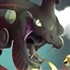
This was a really random one. I know there's a big craze about foxes, and I don't usually draw them, so why not? I tried to base its colours on planet Saturn's, and there are a couple motifs i added, like the dragon storm, the rings, and the symbol of Saturn. you can see pretty much all the colours I used on this drawing, so if you're an aspiring artist yourself, don't limit your palette!3 hours?
Art (c) DracoPhobos/Hayden Busse
DO NOT replicate or use without my permission.
Related content
Comments: 44

This is absolutely amazing! 😲 You’re a really gifted artist! 
👍: 0 ⏩: 1

I really mean it! 
👍: 0 ⏩: 0

So this is a crit/comment for DracoPhobos , awarded for his participation in this year's DDSuggestionDrive (congratulations again btw!)
Before I get started just a quick apology for this being later than I said it would. Real life reared it's ugly head, sorry dude
Anyway, to work...
It was a tough choice choosing between the work you suggested I look at as I love so much of your stuff. But the above just about pips the post for me, for a variety of reasons, which I'll try and mention below as I go. For ease, I'm going to break this down into sections:
Concept...
You've clearly put some thought into the different aspects of this piece - the things you've brought together to create the whole above. From what I can tell you've basically started with the disparate ideas of 'foxes' and 'Saturn' and run with it. I always enjoy bringing two disparate ideas together which I think is part of the reason your piece speaks to me so much.
Colour...
I'm an enormous fan of picking a colour palette (which yes, as you mention needn't necessarily be small) and sticking to it. You've sensibly chosen two that complement yet contrast and I particularly like the shades of pink you've chosen across the fox's shoulders and legs, and the lightest of the blue shades you have running through the storm dragon. If I could suggest an improvement it would only be that perhaps it might have been nice to see a little more interaction between the two sets. Though I concede that might spoil the overall harmony of the piece to do so.
Form...
Am I wrong to see some influence from tribal art forms here? I hope not. It reminds me a lot not only of aboriginal and American Indian art I've seen but also cave paintings. Particularly in the surrounding of the central figure with star constellations. If it were me I'd perhaps have tried to introduce more of the blue storm as a background feature so as to highlight these a little more?
As a final note I like the introduction of the symbols as a final layer of meaning - something I (as an inked individual) have always felt is particularly important when considering a tattoo design. I'd be interested to know, do you have them yourself? And/or do you tattoo or would you like to? You've definitely the artistic flare to. I could see you becoming the sort of tattooist people travel to specifically to have your work on their skin.
...and that's me done I think. If you've any questions let me know? Either by PM or a reply here. Will try and be a little less tardy with my reply
Cheers,
Paul
👍: 0 ⏩: 1

Thank you very much for the critique! Well I didn't go for a tribal look, but I wanted the overall 'design' to be simple and easy to read, with just lots of colour and straightforward imagery. this actually wouldn't make very good tat because of all the orange, but I really love blending colours together, and because orang and pink kinda skip rein the middle, I found it a fun challenge^^
I put the blue stuff in the bg just because I wanted to expand the palette, as well as make the overall design to have a bit more visual depth.
I don't have any tats yet, but I have 2 plans of ones I made and will get
👍: 0 ⏩: 1

Glad the crit was useful
Yeah, know what you mean about the pink and orange, though I myself do have a pink shell on my left calf. I got round the issue by outlining it in blue so that it pops out of the surrounding skin a bit more.
Your blending is superb, I've never seen anyone do such a good job with pencils. Is there a particular type you use? And out of interest what is the material that you draw on? The end image looks almost photo shopped into place with some of your work, as if you've lifted it from another source.
Good luck with the tats btw. They do hurt but the end result is well worth it I feel
👍: 0 ⏩: 1

I mix up brands with Derwent, Faber-Castell and Prismacolour. I just use standard light coloured drawing paper
Thanks! pffft tat pain ain't nothin
👍: 0 ⏩: 1


And cheers for the pencil advice. I need to be more adventurous with mine...
👍: 0 ⏩: 0

Thank you! I really loved drawing this, and I've been working around this style every little while with a little series of 'space animals'
👍: 0 ⏩: 0
It looks really cool! I love how you coloured it, the colours seem so vivid and intense.
👍: 0 ⏩: 1

Thanks! Looking back this is one of my favourites! I've been trying to emulate the same look with my other Space Animals, but so far no luck
👍: 0 ⏩: 0

This is such a beautiful drawing! I love the colors you used and the way you designed the fox. Everything blends together so nicely and it's just a pleasure to look at.
👍: 0 ⏩: 1

Thanks! I'm working on another like this
👍: 0 ⏩: 1

Cool! I'm looking forward to seeing it.
👍: 0 ⏩: 1

This.... This is looks like digital..
HSHSHSHDUZIWOSHDKWOZNKS
perfect
awesom
xD
👍: 0 ⏩: 1

THANK YOUUUUUU
I assume you, is not digital lol
👍: 0 ⏩: 1

YOOOOU WEEEELCOMEEEEE
I know that..
👍: 0 ⏩: 1

So cute! <3
I like your idea very much, especially the theme 'Saturn'.
👍: 0 ⏩: 1


