HOME | DD
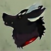
 Iggguana — Basil - Sona

#oc #anthrofemale #anthrofurry #anthropomorphic #basil #furry #furryanthro #furryart #furryfandom #furryfemale #fursona #fursonacharacter #hybrid #hybridanimal #originalcharacter #originaldesign #furryfurries #hybridspecies #anthroanthropomorphic #anthrocharacter #fursonaart #fursonaanthro #fursonaoc
Published: 2018-02-04 13:22:16 +0000 UTC; Views: 316; Favourites: 18; Downloads: 0
Redirect to original
Description
My new fursona basil!She's a canine/dragon hybrid
BIO:
She/her
Age; 23
height; 6.7"
Likes: nature/forests, fruit, stars and adventure
dislikes: vegetables, responsibility, deserts and loud noises.
steal my design and I will end you
:^)
Related content
Comments: 4

She's a cool looking character that's for sure! You've done a good job creating a powerful, yet feminine figure with toned muscles and a refined physique. I also like the clearly different lengths of fur on various parts of her body. Horns on a canine is cool too, best of both worlds having teeth and horns haha
In your post you mentioned that you were a bit worried about the colours blending together too much and I think that's a fair observation. The green and the purple you've used are both very grey and unsaturated as well as being quite dark. I can definitely understand the colour choices, because they're gritty, natural colours that suit the wild nature of the character. I had a think about how you could up the contrast a bit without ruining the look you have going and I came up with a few ideas and crudely made them up in photoshop to show you. I hope you don't mind that I've gone and drawn over your picture
The creamy yellow-white you have for the tail and the ears seems under-used on the design, it's trapped out at the extremities so it can't add much contrast. Adding a ring in that colour between the grey and the green certainly jumped up the contrast a lot, but perhaps that's too much? I like the broken line you did between the black and the green on the arms, so I tried to copy it over: imgur.com/a/0q03k
Another idea you could try is adding a gradient of colour to make her belly lighter and her back darker. This is perhaps a little more natural looking than the rings option, since a lot of wild animals, including wolves are darker on their backs than on their stomachs. It would allow you to keep the overall colour more or less the same, but the extra lightness on the stomach would increase the contrast. I'd keep the dark arms and legs solid colour though. Again, I thought I'd try and add a few little spots of the darker colour over the gradient- it adds even more contrast and still looks quite natural: imgur.com/a/vaTJ4
You could also do both together: imgur.com/a/PwnkN
Either way, you've got a few options to bring some lighter colour up to the chest area without changing too much about the colour palette you've used. How much contrast you're comfortable with is up to you. Some further suggestions you could play around with might even be stripes or spots coming around the sides from on her back. For the face, I think the eyes are plenty adequate contrast while they're open, although if you're going to do lots of pictures like the juice box one with the eyes shut, perhaps you could try adding a splash of that green/grey under the eye to bring it out a little?
One last thing I feel I should mention is that while your proportions are generally pretty good, I think you may be drawing the heads of your characters just a wee bit big. A quick measurement on this one shows the head, not counting the ears, is almost as long as the torso! Obviously, you have a bit of artistic license here (since you're creating a fantasy species), but I think just about 10-15% smaller on the head would perhaps look a little more natural.
Overall though, she's a great new fursona with a lot of potential. The design and colours are unique and interesting, but not over-the-top which is a hard balance to strike. I think you're right about the need to increase the contrast a little but I also think you've got a few options to improve that without completely overhauling the design either.
👍: 0 ⏩: 1

Oh wow 
I think you're spot on with the colors, I couldn't agree more, thanks so much for the photoshopped images, they're really helpful to get an idea of what you're saying. I like your color ideas, and I think the belly gradient is actually a really good idea, I love the look and think it lightens her up a bit. Is it okay if I implement your idea in my future drawings of her?
I think that adding contrast with the white is a good idea, especially since the dark colors blend together.
Yeah I agree her head is pretty big hahahaha, I think i've overdone it. I'll make sure to double check that in the future, I don't want them looking like bobble heads lol.
Thanks again for the critique, you've got some really solid points here and I like the emphasis on improving certain things. keep up the great work!
👍: 0 ⏩: 1

You're very welcome, I'm really glad you found it useful haha!
And yeah, of course! If you like any of those suggestions then go for it, she's your character! I figure it's easier to explain some ideas by having a go at it myself, I'm sure if you play around with them a bit you can find out what works best for you.
👍: 0 ⏩: 1

Yes it was very helpful!
Thanks heaps 
Thanks again
👍: 0 ⏩: 0


