HOME | DD
 jazuk — GI Taste the blue

Published: 2004-01-16 12:11:17 +0000 UTC; Views: 334; Favourites: 2; Downloads: 91
Redirect to original
Description
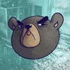
This is a lighting test more than anything.. and a WIPThe model is old but improved..u may recognise it.
let me know..any ideas
jaz


Related content
Comments: 11

threeeeeeee-deeeeeeeeee
that looks swwwwweet man
nice blues, and the forms are quality
i like the blurry effect too, gives it a lot of depth.
👍: 0 ⏩: 0

you know what? a metallic-like texture could be nice 
👍: 0 ⏩: 0

nice work
the model is excellent,
you should try increasing the GI, or adding area lights, and maybe making the background white or a lighter shade of blue
and the bluring the bottom model is a good effect
👍: 0 ⏩: 0

Yeh , would like to see that model worked on , on it's own with some nice colors.... good stuff mate.
And i know u nod ur head to JEHST!
👍: 0 ⏩: 0

That looks really cool! I wanna reach out and touch it!
👍: 0 ⏩: 0

Mmm... Blue... The model looks like clay.
I like it...
And... Yeah. I don't have any suggestions because I'm pretty clueless when it comes to stuff like this.
👍: 0 ⏩: 0

wot about a very small increase in ambient lighting so theres no dead black on the model?
u can always paint bits back in where it needs it..
👍: 0 ⏩: 0

I'd love the spotlight lighitng as the black fringes are kinda distracting. Also the model should be a slightly different shade to make it stand out mroe perhaps? Just a few suggestions.
👍: 0 ⏩: 0


