HOME | DD
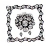
 Jessito — Inchy the Caterpillar
by-nc-nd

Published: 2010-04-27 08:17:51 +0000 UTC; Views: 935; Favourites: 17; Downloads: 22
Redirect to original
Description
Inchy the Caterpillar..a tiny,tiny fellowRelated content
Comments: 17

Много хубав фон наистина! 
👍: 0 ⏩: 1

Мерси
👍: 0 ⏩: 0

Hi ~Jessito ! This is ~Nina-the-Tiny from #Critique-It and I'll be critiquing your piece below:
The first issue you bring up is the background in the center and making the caterpillar stand out. You definitely need to use the high contrast you have in the border if you want the caterpillar to stand out. The reds and greens (I think I see yellow?) you've used help, but you need to add more of that, and in a stronger saturation. Are those colored pencils? I would suggest marker or whatever you used for the border, but if you have none, applying the colored pencils heavily can do just fine. The caterpillar doesn't stand out because it's partially in pencil, on a background that's too soft in pencil, with a border that is very strong and high contrast. You can balance the border's strong black and white with very strong, bright colors. I suggest inking the caterpillar, and then coloring it with the light green-yellow and other bright colors.
Now for the center background, I have to raise this question - is this an abstract piece or a naturalistic piece with an abstract border? Because if it truly is supposed to be abstract, then the center background should be a continuation of the border. The colors on the caterpillar will help make it stand out, but the pattern/design you have in the black marker can define it as abstract, and really contrast nicely with the bright caterpillar and its complex lines. In other words, dump the center background stems and other pencil-done lines, and just continue the border's pattern right up to the caterpillar. If you ink the caterpillar and give it a thick defining border, this can really make it pop!
If this piece is not supposed to be abstract, then keep the border where it is, and instead, color in the center background. The pale use of pencil makes it look smudgy and unfinished – by inking that and coloring it in, you'll make the piece stronger. Using color to differentiate between the caterpillar and the center background can help prevent the caterpillar from getting lost in the piece, but also keep the whole thing interesting. I would use a very saturated green, as long as you balance it out with a more yellow-green in the caterpillar – don't use the same green for the caterpillar and the background, or it will fade into the background. Since I'm assuming the piece is not supposed to be abstract (for this paragraph), I would cut the border in half. Literally. Then stand back, and see if you need to adjust it or add more to it. But it's way too much for a purely representational piece.
Overall, the technical representation of the caterpillar is really well done, and I think the border could stand on its own as a very cool abstract piece. Keep working on this!
👍: 0 ⏩: 1

Thank you so much for the detailed critique!
I think you made some very good points.I knew something was wrong with the colours just couldnt figure what exactly.
I used markers to colour the caterpillar though.Maybe the picture quality doesnt do the colours very well:S
I will keep this one as it is to remind me of my mistakes but will make a new one and ask you again for your oppinion.
Thank you so much for the time and effort 
👍: 0 ⏩: 1

You're welcome! I'm glad I could help, and I would love to help you out in the future!
👍: 0 ⏩: 1

Lovely, I really like the whole background idea, really makes him stand out
👍: 0 ⏩: 1

Aw thank you so much! It was real fun making it
👍: 0 ⏩: 0

хаха не казвай на никого.. светльо няма да иска да ми трепе буболечките после
👍: 0 ⏩: 1

in a good way i think. therefore i exist. shit.
👍: 0 ⏩: 0

Thanks 
👍: 0 ⏩: 0


