HOME | DD
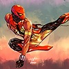
 NunoPlati — STARHAWK

Published: 2007-05-03 15:54:48 +0000 UTC; Views: 3496; Favourites: 59; Downloads: 74
Redirect to original
Description
This is for a slight reimagining i´m doing just for fun, of the Guardians of the Galaxy.Just a slight tweak here and there to these low profile Marvel heroes.


Related content
Comments: 14

ZOMG!
I hadn't thought of StarHawk in years. He was my favorite Guardian.
👍: 0 ⏩: 0

Those good ol galactic comic heroes, I loved them too!
Keep it up, they're great!
Salutz
👍: 0 ⏩: 0

That is so awesome... GUARDIANS was one of my favorite books back in the late-70's/early 80's.
👍: 0 ⏩: 1

This is an instant favourite!!!! Much impressive redesign!!! Will we see his female counterpart Aleta? lol
👍: 0 ⏩: 0

OH DAMN! i actually wanted to see you do these guys, i am stoked! he looks great nuno. yondo, martinex and charlie soon? keep em up, love the old marvel characters and your spins on em are just awesome.
👍: 0 ⏩: 0

Nice, about the only thing I would like to be able to see better would be how the wing-things overlap. You can see it in the drawing really well, but it kind of gets lost in the colors.
Can't wait to see more!!!
👍: 0 ⏩: 0


