HOME | DD
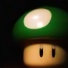
 rehabilitative — Mario Mushrooms

Published: 2008-01-06 09:32:15 +0000 UTC; Views: 9987; Favourites: 136; Downloads: 11004
Redirect to original
Description
V2This was just a quick drawing.
Second uploaded version, I just did a bit more blending, should look a tad bit better.
Thanks to Prismacolor pencils, I love them <3
Mario Mushrooms from Nintendo.
Related content
Comments: 32

I was searching for some fun illustration to add to my slides for my defense, and yeah, I'm seriously in love with this one.
Can I use it on one of my title slides? Prettyplease? :3
👍: 0 ⏩: 1

This picture looks lovely when scaled down.
Here's the WallPaper I made.
[link]
👍: 0 ⏩: 0

This is absolutely amazing. I love the simplicity, yet it just seems so real (as real as anything from Mario can get at least)
I love it.
👍: 0 ⏩: 1

Thank you so much. =]
👍: 0 ⏩: 0

The coloring/shading on this is exquisite! looks lovely!
👍: 0 ⏩: 1

Whoa. That looks too good to be drawn but it is drawn! Good job.
👍: 0 ⏩: 1

Oh joy joy happy happy ^.^once again your coloring brightens my day i love this work ^3^'thee's no evil purple mushroom though =3= 
👍: 0 ⏩: 1

I wish I could add all the mushrooms into one, there are just so many! Thank you. =3
👍: 0 ⏩: 1

Ha ha no problems.
👍: 0 ⏩: 0

I. love. it, as I told you at lunch. it's so damn cute! Your blending and pencil crayons skills are amazing, dammit! D: *enviiies*
👍: 0 ⏩: 1


👍: 0 ⏩: 0

HAHA 
👍: 0 ⏩: 1

it looks great as is. ^^ your blending is really good. from personal experience, how is blending with colors compare to black and white? just curious :3
👍: 0 ⏩: 1

Do you mean blending with both black and white?
I personally hate using black, and it’s never been recommended to be used. That’s why all my black is just outlining with ink.
With colour you get shades of all ranges, darks and lights, so it’s easy to blend and fix mistakes, plus your eyes have more things to take in at once so mistakes aren’t that noticeable. Black is a dark, strong colour, and using it is really risky to mistakes, because your only focusing on one colour.
You can tell my colour blending isn’t that good, it’s un-even and a bit broken in some areas, but you can’t tell that much. If I used black or did it all in black an white, those mistakes would pop out much more… it would look horrible.
I don’t really know much about this, all I know is I don’t like using black, and avoid it when I can.
Blending with black is just harder to less-fun to do.
👍: 0 ⏩: 1

i know using black in anything is a pain. especially when it comes down to pastel. it sucks. mixing a bunch of colors to gain a dark color is so much more funner. ><
but actually when i meant black and white, i meant shading with just a gray scale. like if you used pencils, just shading with that in comparison to colors. but i do get what you meant about the mistake awareness. ^^
👍: 0 ⏩: 1

I don't like shading in greyscale either. It takes long to build up, and I’m not good at it, I don’t have a steady hand and I rush everything. It’s a bad habit but I just want to get things done. I’ll stick to colour
👍: 0 ⏩: 0


