HOME | DD
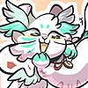 Rubberbird — Creme Soda

Published: 2018-02-05 01:52:38 +0000 UTC; Views: 216; Favourites: 22; Downloads: 0
Redirect to original
Description
I recently picked up a new doodle style and would really appreciate it if you could drop me a critique on this specific doodle if you have the time!Both pointers of what I did good and what I could do better would be awesome
Related content
Comments: 10


The first appealing thing I noticed in this is the organic feel it has, which is amazing :"0 there are so many right things about this:
1. The balance of colors is just so right. The colors you picked for the shading agree with the background colors and makes Sparkle fit so well in the picture and it makes it a whole, a very satisfying whole.
2. The transition of colors on the lineart! It makes her blend with the rest of the picture even more, and the fact that you reinforced the shading by also shading the lineart makes it stand out! That's one of my favorite things about this.
3. The two different ways of shading combined together. There's a soft, pinkish shading that goes well with her yellow and there's a bright pink shading that gives the feeling that the environment is bright, happy and involving.
4. The way you colored the background in a more simplistic way than the character, but you were able to still keep the same style for both. I like it how it doesn't take the focus away from Sparkle, but at the same time it completes this piece. The white spaces around the main elements are an awesome touch as well.
The only thing I observed that seems a little off is that the drink isn't detailed enough to be a main element, but isn't simple enough to be a secondary element (like the background) so I don't know if it should be one of the main focuses or not. I'd personally add the same amount of detail that you added to Sparkle to it. But that's just it, it is not a major thing and doesn't take away the impact of the picture at all!
👍: 0 ⏩: 1

Sorry that I'm responding to this so late!! I wanted to be sure to have the time to thoroughly respond to your critique.
1. Eyyy, thank you very much! Truth be told, this doodle's main focus isn't really the line art. Proportions are still pretty important, and me practicing my art style is also important, but what I focused the most on was the colors. I was really surprised to find that the pink went with the yellow! I have shaded Sparkle with warmer colors in the past (mostly orange), but using something so bright was a new idea.
2. I'm glad that it worked!! This whole doodle was done only on one layer and it felt reeeeeaally weird to trace my own line art with a whole different color. I had to glance at it a couple times to make sure it looked ok before I posted it because of how weird I felt about the process.
3. Haha, I didn't really plan out what mood I wanted this drawing to have so honestly I have neutral feelings about it. It's really nice to have some outside perspective on this!
4. actually the abstract background is a lazy attempt at a background XD I was totally going to draw in a restaurant/dining hall with tables... I'll have to practice how to make backgrounds that don't detract from the focus of the main elements in the future
I wholeheartedly agree with your evaluation that the drink should be more detailed because it is closer to the viewer! I think I could have drawn in more bubbles in the liquid and added more depth to the creme,, but I'm not good at drawing liquids yet so I don't know if my propositions are good :'D
👍: 0 ⏩: 0


👍: 0 ⏩: 1
This is amazing! I wish i had this talent to make this style of lineart, it is hard to critique this artwork, specially because i need to know what you want to improve, for example, you maybe did the thick arm because its your art style, or didn't make a muzzle, and because its a doodle, so i'm going to take everything, and what you want to improve you take ^^
Anatomy~
-I've seen sparkle's ref and it's apparently a fox, right? (And i knew somehow it was a female lol) so if you want to improve fox stuff (which i don't think you want, this is kind of a chibi) i'm here e.deviantart.net/emoticons/b/b… " width="15" height="15" alt="


>>Sparkle's ears look too thick and larg, at least compared to the ref, and the left (right in sparkle's point of view) ear looks bigger than the right one, the same thing for the eyes
<

>>Her left paw looks really confusing, because of the white fur it looks that there's some problem with the table (looks like the arm is inclined to the camera) and the way the paw is shown is confusing too
<

>>The tail is really big, right? Is this point of view it looks like half of the tail got cutten, like a bunny with a bigger tail (unless the oc changed)
<
The straw idk if you did on purpose or not, but the part of the straw inside the soda looks amazing, because of the little zoom it does in liquid e.deviantart.net/emoticons/b/b… " width="15" height="15" alt="


Shading~
>>I can't lie, the shading looks REALLY messed up. Unless it should be like that, there is a lot of sources of light in this art, for example: The pink shade in the ears make it look the light is in the top left, but then the tail , the back and the white fur in the ears make it look like the light in top right, the totally shaded arm looks like the light is somewhere in the right side, the light yellow shading looks like the light is in the camera etc.. Without mentioning the way the shaded fur in the white neck fur looks like jewelry ^^'
<< Try to get a source of light first (duh) and then you do the shading
Hint: try to make the nitid lineart when there's something shading what you're shading, for example the body shading the table, and less nitid the shading made because of lack of light
So, as you asked, i'm going to say the nice things too of this artwork, even if i don't need to
+ Soo cute! One of the reasons i chose this art to critique
+ This lineart (doodle but yea) is so beautiful to me!
+ The color pallete is amazing! It matches with the color and i LOVE pink shade
+Your style is just gorgeus!
So this is my critique ^^ (sorry for any english mistakes, i'm not fluent)

Aaaah, thank you so much for taking so much of your time to write up this critique! I understood your words perfectly, so there's no need to worry about your fluency. :0
1. About the ears - Yes! Perspective is definitely one of the things that I need to work more on. The colors and her body shape isn't based off of her ref as I gave myself a pretty broad range of artistic liberty with this doodle, but I'm very impressed with your attention to detail! Unfortunately, consistency is still a thing that I'm working on, so Sparkle's ears tend to very from drawing to drawing XD
2. Could you elaborate more on what makes her left arm/paw confusing? I'm not quite sure what you mean when you say that the arm is inclined to the camera.
3. I totally understand what you're saying about transforming/copy+pasting the eye! I don't usually do that because it's really hard for me to achieve the right perspective if I do that -- do the current eyes look asymmetrical to you? As for her right pawpad, I also agree that squishing it into her cheek would give the pose a more dynamic emphasis of movement. I'll try to keep that in mind next time!
4. Yes! Her tail is supposed to be super big and fluffy, and truthfully I didn't know how to draw her tail in this picture. It's supposed to be pointed down in a relaxed manner, but since her tail is so fluffy, the part where the tail connects to the body is shown. (In other words, only the very tip of the top part of her tail is shown. The rest of her tail (probably about 90% of it) is not included in the picture). Do you have any idea of how I could otherwise draw her tail?
5. Shading - your argument here is definitely valid. I usually pick the light source to be in the upper left hand corner of a picture by default, but then from there I shade based on the feel of the picture (again, I still need to do more realism studies to get a better grasp on how shading works). The shading of the different body parts definitely do not match up in this picture XD. It's actually kind of cute that you say that the shading of the neck fluff resembles jewelry! I personally have no experience creating a successfully shaded piece of fluff, so I improvised with a messier version (again, shading based on feeling)
And thank you for the compliments as well, haha! I'm glad that there were parts of this experimental doodle that you got to enjoy :}
👍: 0 ⏩: 2

I'll reply here so I can access this in the future when I come back to it!
I really really like your explanation of the ears, tail, and the arm!! Giving me alternate poses/views of it helps me visualize it in 3D (especially the head drawing with the ears! I had to chuckle a little bit at how it would have looked like from the front)
The arm that you proposed definitely looks a lot more organic than what I have in my drawing
I'll also work on making the tail look like it has more of a direction as well
aaaaah, thank you so much for taking time to draw this for me! I really appreciate the amount of effort you have put into this ;o;
👍: 0 ⏩: 1

My pleasure to help you ^^
👍: 0 ⏩: 0

2. I'll make a sketch, i knew you would be confused ^^'
3. It was an example, i was reffering to the arm
4. I'll help with that in the sketch too!
👍: 0 ⏩: 0

man im not good at critique so i wont, but gosh the colors are amazing. i love those little circles on her face?? they add a lot. ur use of color is fantastic i ssrly love it
uhmpfff for things u can do better.... i think put more detail into the drink? the background looks fine all abstract like that but i think the drink could use a bit more detail since its in the foreground there:3c
👍: 0 ⏩: 1

Ey it's ok!! I really appreciate you taking the time to write something about this drawing ;o;
I'm pretty happy with how the colors turned out too! I picked it all by hand so I'm surprised that I'm starting to have an eye for color haha
Perspective/details is definitely a thing that I need to work on in general (asfjk I've been meaning to do some reference studies with photos for this purpose) -- thank you so much for reminding me about it!
👍: 0 ⏩: 0


