HOME | DD
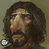 ScottPurdy — Stringy Chin

Published: 2012-06-20 19:01:31 +0000 UTC; Views: 1327; Favourites: 46; Downloads: 0
Redirect to original
Description
Just sketchin'Related content
Comments: 20
Nice sketchy strings, Scott! I'm interested in your recent fiddling with low contrast, what lead to this?
👍: 0 ⏩: 1

Good question!
I've been holding off answering this since you asked it, because I've been wondering why myself.
2 reasons, I find my greyscale tends to be a little too dark for print, so working this way might help that.
The other reason is practically the same, when I sketch or underpaint ready for digital colour painting I find the painting can turn (very quickly) a little too dark. Because I'm usually using multiply layers to paint on the darks get darker and darker with each wash... if I start with low/lighht contrast I 'seem' to have more leverage/control in which direction I want to pull the tones, and it 'seems' I have more control over the opaque painting too.. blah, blah, blah!
Or so I like to think.
And I also like the lower contrast greyscale look.
👍: 0 ⏩: 1

Interesting! I've had similar issues with my greyscale art being printed on the often sub-par paper inside RPG books, I also use a lot of dark tones so my works risks being printed as black rectangles.
👍: 0 ⏩: 1

Yah, crap paper is the culprit.. curse rpg books.
👍: 0 ⏩: 0

Disturbing and kind of gross, as always- good sketch!!
👍: 0 ⏩: 1

Nice work! Kinda reminds me of Stephen Gammell's style.
👍: 0 ⏩: 2

Heh, I've looked at his stuff and I don't think my stuff looks anything like his.. maybe it's the theme? But you're not the only one to say that, cheers
👍: 0 ⏩: 0

I don't know how Gammell got away with such creepy (albeit amazing) illustrations for young children's books. I got to meet him and see his studio when I was little, you'd never guess he was capable of such scary stuff!
👍: 0 ⏩: 0


