HOME | DD
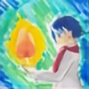
 Sparkleswords — Fragile Heart

#fanart #sad #thistle #sendhelp #daughterofthelilies #daughteroftheliliescomic #floatingindarknessbackground #thistleistooprecious
Published: 2017-05-12 23:42:15 +0000 UTC; Views: 945; Favourites: 16; Downloads: 0
Redirect to original
Description
...I'm not drawing Thistle too much, YOU are!Thistle is from MegSyv 's super-awesome comic, Daughter of the Lilies , which is just continuing to get better
I tried a different way of drawing this time, where I did the sketching and then lineart traditionally, then scanned it in and colored it digitally (and I finally figured out how to make the white paper transparent in FireAlpaca). I think it worked well! I always sketch better with a real pencil, but I can color a lot faster and fancier digitally.
I just told you how I made this picture it's traditional + FireAlpaca
and seriously, if you like mysterious-but-adorable protagonists, shouty elven archers, dragons, and getting your emotions destroyed, check DotL out!
Related content
Comments: 9

Hello! I am here from
I am sorry that it took me a while to get to your fine work!
Interestingly, your "new" way is pretty much exactly how I usually draw. My sketch and lines are always done traditionally - so it's nice to see someone who also try it out! 
Now, how to make this piece even better?
The first thing that strikes me is that Thistle's head is comparatively larger than the rest of her body. I know part of it has something to do with the hood, but if you drawn an outline of the head, it's still a shade too large. One way to mitigate that effect is to have the blue light reflect off the interior of her hood to delineate head from hood. It'll also make the image look more realistic as well. The other thing is the heart itself. While everything else in the picture as a thick outline, the heart doesn't. Therefore it looks a little less like a 3D object and more like something that's printed on her tunic. That's unfortunate, really. You might consider adding some shading to the interior of the pieces of the heart to make it appear to be something more substantial. And in order to achieve that, you may also want to reduce the number of broken pieces as well. After all, it's not the quantity that counts, it's the quality.
Overall, I think you did a great job drawing an intriguing character. And thank you for introducing me to this series. I might start reading it when I have the time to do so. In the meantime... keep up the good work!
👍: 0 ⏩: 1

Thanks for the comment!
Ha, the head proportion is a little bit funny...I drew her in my "normal" character proportions, but it didn't occur to me until after that it would look a bit odd.
I had thought about adding more shading to the heart's cracks, but the pieces were too small for me to add anything noticeable to, and I guess I just didn't think of taking a few out.
👍: 0 ⏩: 1

Hello!
And thanks for writing back. I hope the comments were at least a little helpful to you! And if I was able to provide you with something that you find useful, I am very glad.
... and no, the head isn't -that- big. Just slightly bigger, you know? 
👍: 0 ⏩: 0

Design reminds me a great deal of Assassin's Creed.
👍: 0 ⏩: 0

My mom and my sister read that comic.
I'm too busy making stuff, but that doesn't stop them from telling me to read it.
👍: 0 ⏩: 1

Well, I'd say it's well worth the read.
👍: 0 ⏩: 0

WHOOAAAA I love the colors on this! The lighting is so good! And what a powerful visual metaphor!!
Thank you so so much!!
👍: 0 ⏩: 1

I'm glad you like it! It actually turned out a lot nicer than I expected...I think I was inspired by recent pages. Wish I'd get inspired to do something this nice more often, though
👍: 0 ⏩: 0


