HOME | DD
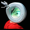
 Spiritofdarkness — The Red Green Light

Published: 2008-02-28 11:20:07 +0000 UTC; Views: 1197; Favourites: 28; Downloads: 43
Redirect to original
Description
played a bit arounda bit of mentalray and a bit of photoshop


hope you like it . . . (especially you, ~joerx


 )
)


Related content
Comments: 37

👍: 0 ⏩: 1

👍: 1 ⏩: 0

It reminds me of some high level weapon from Worlf of Warcraft. (:
👍: 0 ⏩: 1

Love the design of it ! 
-
👍: 0 ⏩: 1


👍: 0 ⏩: 0

Einfach cool, die Farben, das Ornamentale. Gut rumgespielt.
👍: 0 ⏩: 1


👍: 0 ⏩: 1

Lovely! Really Art-Noveau style, and a piece that Galle or Daum would be proud of!
👍: 0 ⏩: 1


👍: 0 ⏩: 0

Weeeellllll .... rather difficult. On the one hand it's an intricate piece of modelling, but on the other it hurts my eyes ^^ Sorry, but the refraction angle of the glass material is just skewed enough to make it look jittering to me and makes it hard to percieve the outline of it.
But that's a minor problem. What really concerns me is the question:
Why not place it into a neutral environment ? The whole corner background looks quickly made and without love at all. Why bother with it then? It really degrades your other work which looks organic and quite interesting. Okay there could be another point of interest in or on the top bauble, but that's just tastes.
👍: 0 ⏩: 1

thanks for this coment man, quite appreciated
👍: 0 ⏩: 0

YEAH ! Now it is organic !
You´ve finaly earned your fav !!!!!
👍: 0 ⏩: 1

It almost looks like some sort of funky guitar
I like this - it's very realistic indeed! Nice use of texture and colour. I think the background is a little distracting as it doesn't look as real as the object itself - but other than that I think this is great, well done ^_^
👍: 0 ⏩: 1


I'm glad you like it; yea, on te background is a little bit more photoshop, thanks
👍: 0 ⏩: 1

You're welcome 
👍: 0 ⏩: 1

Awesome lighting effects, it tricked me into thinking it was a photo when i saw the thumbnail. Excellant work.
👍: 0 ⏩: 1

this really cool to hear, thanks a lot man
👍: 0 ⏩: 0

Really weird feel on this one. Like it tho.
The clashing works very well, I think.
👍: 0 ⏩: 1


