HOME | DD
 sscindyss — Glamour 3

Published: 2008-10-01 09:23:22 +0000 UTC; Views: 2073; Favourites: 49; Downloads: 57
Redirect to original
Description
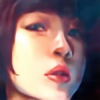
My head was blank when I drew this, I don't even know whatI want her to be...
I toned it with purple, more mysterious...
Used about 4 to 5 hours... I think...with poster color.
I'm still not use to painting... Kinda lost my patience around the lower part of her hair...
But, at least I tried to paint with dark colors...
1. Original [link]
2. Black and white [link]
Related content
Comments: 12

She look beautiful! I love that seductive eye, the rosy cheeks and lips, and that detailed bouncy hair!! <3 It's gorgeous I envy your talent!!
👍: 0 ⏩: 1

Eh,who says ure not good with painting.This is superb man!!
👍: 0 ⏩: 1

It's poster color... I'm still bad in water color... Too runny...
👍: 0 ⏩: 0

Overall, I think this is pretty good although the colours turn out to be dull after you scanned it. Did you adjust the contrast and highlight on the scanned image?
Seriously, I think this would make a great looking graphic art if you keep the hair lines and details tidy. The overlapping white lines only make things messy and you should minimize the use of white lines for highlights.
Theme wise, it's more fantasy than glamourous. If you take a look at fashion mags' cosmetic ads, they are usually clean and sleek.
Anatomy wise, her eyes are way too big like goldfishes' and that explains the short forehead and ears being too close to the eyes. Always keep a distance about an eye length in between eyes and ears. The forehead should be about a nose-length high and don't let big eyes dictate all over the face.
Most bishie artists has problems with anatomy and facial strutures because they don't know how to draw realistic human figures and portraits. To counter that, one must first learn how to draw humans realistically before bending the rules to something else cartoony and bishie.
Keep it up
👍: 0 ⏩: 2

Oh ya, thanks for the comment!!
👍: 0 ⏩: 0

Oh, it can be adjusted?? No one told me that...
Oh... Should i change the title again?? I don't have a title for her anyway.
Ok, I'll be more careful with the face next time. Where can i learn realistic??
👍: 0 ⏩: 0

<333333333333333333333333333
Ohh, this is beautiful! I thought this was done in PS before I read the comments. Ack, truely a testament to your skill~
👍: 0 ⏩: 1

I am awful with PS...
👍: 0 ⏩: 0


