HOME | DD
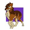
 Sydelergy — Sips and His Little Friend (Contest Entry)

#amazing #contest #cool #cute #digitalart #entry #fall #sips #deerhuman #firespirt #mochawulf #clipstudiopaint
Published: 2019-05-11 00:17:05 +0000 UTC; Views: 432; Favourites: 18; Downloads: 0
Redirect to original
Description
Hello and good evening UwUThis is an entry for 's contest OwO
I have been working on this mostly non-stop from 12:00 am - 6:00 p.m today =w=
I think I am all arted out
I chose Sips (one of Wolfy's OC's) for the contest because HE IS JUST SO CUTE >WThis piece was soooooooooooooooo fun to make
I put so much detail into it because I wanted to make the best for my friends contest UwU
His little friend is having a heart attack. Idk why...
I had so much trouble with the background until I was like "SCREW IT" so yeeeee
Also, I tried out a new technique of shading idk what it is called I just thought it looked nice
AND YA KNOW WHAT!?
I'm going to enable critiquing for this one cuz why not
Idk how this will go but whatever >w>
Don't be scared to point out all my flaws just be nice about it, please
This will help me grow as an artist and you are helping in more ways than you know UwU
Related content
Comments: 9


THIS LOOKS PRETTY DANG AMAZING!!
The shading looks really great, the technique is beautiful! I'd recommend doing shading with a cool color though- something like a very dark blue or purple.
Sometimes grey can make it actually bring it forward or just makes it look dull (though I see you're wisely avoiding greys)- tones of blue/purple maintain the richness of color as well as ensuring the shades look like shades and not an odd marking.
Likewise, using warmer colors can help add shine instead of using a paler color! You got the idea on the ribbon especially and hair too, but adding some more of the golden color on the arms, face, pants, etc would've helped solidify the firey character in the piece and helped them look like an actual fire.
Another final tip is to use multiple shades/shines. Vary the darkness/brightness of the drawing. Having two or three shades of darkness and two or three shades of highlights can really help add contrast and make it feel more natural.
The texture of shading on the fur looks great!! The little lines help give the idea that it's fur instead of flesh or something smooth. Of course, it also makes the pants and shirt look fluffy too XD
The firey guy does look kinda firey, but it would've helped to have a wider range of colors because fire is literally a ball of light and has a lot of contrast.
The expressions and positions look very nice! The overall composition/placement of the characters is well done!! The background serves as a nice frame for the characters, making them feel more solid and real, though a cast shadow on the background would've helped too. The subtle shading on the edges help make the characters the center of attention too!
The antlers look very nice and fit well with the character design! The character design in general, with colors going nicely together and being unique and creative AS WELL AS maintaining a consistent style IS AMAZING!!
Overall, it does look REALLY GOOD as it is, but the best way to improve from here is to focus on shading!
👍: 0 ⏩: 1

Omg, thank you so much!!
This is SUPER helpful!
Now I will reply to all your points UwU:
Yeah about the shading... my tablet screen is really weird. It adds like a reddish tone to my actual screen so when I was making this piece I thought it looked nice (all the colors were warm and went together) until I looked at my laptop screen =w=. I'll try and get those tones right (I fixed it I think)
Thanks for the tip on lighting! I will practice it!
as well as multiple shading UwU
I thought of that while making the new shading XD I wanted to make him look super fuzzy OwO
I want to practice more on fire! It is such a cool element! I will keep that in mind when I am practicing.
And thanks for the rest! I really tried on my sketch to get everything right (which took more than an hour ^^") and I thought the background was a nice touch
I will keep your points in mind while I am practicing UwU
Thanks again
👍: 0 ⏩: 1

I'm glad I could help!! Have fun
👍: 0 ⏩: 0

Ahh! This is awesome! Lmao you even added his friendo. ^w^ Like I've said to others who have joined, good luck to you.
👍: 0 ⏩: 1

Thank you ^w^
yeah I saw it in your sketch so I wanted to add it OwO
thanks again UwU.
👍: 0 ⏩: 1

Np! Lol the fact that you added him just surprised me so much. XD
👍: 0 ⏩: 1

XD when I saw him I couldn't resist adding him UwU
👍: 0 ⏩: 0


