HOME | DD
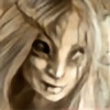 Whobleyh — I stare at you

#closeup #fae #fairy #fantasy #krita #portrait
Published: 2016-12-06 00:02:56 +0000 UTC; Views: 649; Favourites: 67; Downloads: 1
Redirect to original
Description
She does. Don't know who she is but there she was.Finally kinda made krita work without my pc blowing up XD
Tried out all sorts of brushes and stuff and voila, with freckles and all.
Think she probably is some sort of fae as she seems to have this glow on her and crystal blue sparkly eyes.
Related content
Comments: 48
Very pretty, a dryad perhaps.
The texture on her skin seems it may be transforming from tree bark.
👍: 0 ⏩: 1

I can see her as a dryad, yes
She certainly seems to have an affinity for flora
👍: 0 ⏩: 0

Personally that is my favourite piece in whole your gallery.
I really love these calm ice cold eyes and tightly clasped mouth.
She is in the same time absolutely calm outside and dangerously angry inside.
It is not just portrait of cute and empty girl, which I can see many on dA. You perfectly caught psychology of this character, what is not easy at all. Her eyesight really hypnotise and I could look at her for hours trying to resolve how you've achieved such stunning effect.
When I saw her for the first time, before I read description, I imagined a wild witch living alone in the forest and disliking strangers. But she might be fae as well. Wild and dangerous one.
I can't stop wonder how you do that, that you manage colours so well (not only on this piece but in all your works). I really love how you make her face perfect by making it imperfect. She's a little bit greyish, but not in incorrect meaning, it looks really natural and good. Just gives impression as if her face was a bit dirty with dust and she didn't care about it, and didn't feel ashamed, just confidently looking at watcher. There is nice contrast between her confidence and this dust.
I really like the way you made freckles and pores. Especially for this first it's not easy to match right colour, brush intensity and size. These latter greatly add extra light to the piece.
Vine reddish violet with burnt umber over eyes greatly plays skin shades above eye, and greish reddish violets below. The way you painted nose is just a masterpiece. You used brush on screen filter to do that, right? And for cheeks and forehead too? It gave natural warmth and and made her looking alive. I also very like pale teal colour for hair, forehead shades and eyes. That's very interesting idea to use the same colour in eyes.
That is really really good piece. Making it more realistic would destroy the mood you achieved here. Thanks to that it's a bit sketchy, gives it character. I really really love this piece, and it's rare that I stare at something so long as on this work ^________^.
👍: 0 ⏩: 1

Wow what an awesome comment to get
Sorry for the time it took to reply back.
Needed to sit down properly first XD
My family asked if I made a selfportrait when seeing this one.
It was not intentionally 
But I guess that maybe because of pooring some of that psychology and character into her,
I put some of myself aswell 
And as subconsious is what it is for a reason, not to be controlled, I guess that the wild witchy feel makes sense
About the colours, I indeed use layering with overlay effect to mix and try out
To make some extra depth to the palet I use
Sometimes I play around a bit with levels and curves to see if there are some interesting contrasts and effects coming up.
I think mostly leaving behind the logic behind what colour a thing should be, using a teint that inhabits the feel you want to express does more to a painting
Also, and this is a logic part actually XD, ambience touches everything.
What we see is never a pure colour, lights and shadows transfer a place it's teints to all that's there.
To keep that in mind when painting gives it it's own life
The lighting on the nose and face, think I used some screen there yes and overlay
It was not much work, went very easy 
It just fitted when I did so if you know what I mean XD
Great for me to hear that she captured your attention in such way.
That she made you wonder
I'm happy you like her and thank you very much for telling me what it all is that speaks to you!
👍: 0 ⏩: 1

No problem at all. Take you time, doesn't matter how much you need, a week, a month or more. I know it's always worth to wait for you comments and replies ^_______^.
You know, I read in one of my books about drawing portraits that if artist draw any portrait from memory he unconsciously makes a model similar to himself (gender doesn't matter here, just see Mona Lisa, I've heard it's selfportrait of author, despite he was man, not woman).
Yeah, all that digital stuff is really useful ^_______^. I use most of these effects too. Especially screen and multiply ^_^, but I gradually experiment also with filters like sharpening.
Oh, you're welcome ^________^. It's pleasure to visit worlds you create and share my thoughts.
👍: 0 ⏩: 0

OK, first off, I love how you handled the freckles. AND THE EYES. UGH. Such a beautiful piece! And I love how it's not highly saturated color wise. You really handled all the details so well, good job!
👍: 0 ⏩: 1


Don't like it when they make war in my paintings so I guess that's why they never become to saturated.
Very happy to hear that you like this freckly staring lady
Thank you for dropping by and tell me why!
👍: 0 ⏩: 1

Totally with you, sometimes bright colors can compete and take away from the piece. It's actually really nice you said that, you have a great understanding of not only complmentary colors but how to use them effectively. Absolutely!! Sad to say the people who deserve it most tend not to get lengthy appreciative comments on the hard work they put out. So I thought you should know
👍: 0 ⏩: 0

I love this so much! I adore how her skin looks. :} She really seems like some create from swamps.
👍: 0 ⏩: 1

Happy to hear you like her
Something created from the swamps.
I like that thought, swamps hold ancient things
👍: 0 ⏩: 0

I think this design is pretty awesome. Definitely not what I’m used to seeing.
Overall I really like it, would be amazing to see it turn into a character on a game, or movie. She’s got a bit of an awaken “knowledgeable” look to her. Was that your aim? I’m curious about that.
Only off things I can see… I think her right eye brow is shaped different or doesn’t go as far off. It throws off the symmetry if you look too closely. Eyes are still very well done. Overly sharp in some parts. I’m not sure if that was on purpose – it looks like a skin texture actually, so it’s pretty cool. She needs Chap Stick too.
On a positive side, I love the colors used – I’m so tired of the flashy bright graphic design people constantly upload. There’s a nice complacency between light and dark in here. Somewhere in there, her gaze as she “stares at you,” it’s easy to get lost in. I especially enjoy the freckled effect you implemented – nicely done!
I can’t say much more besides, “Spectacularly conceptive design humbling persons’ souls.” Wow, almost at 200 words, so hard, almost there, two hundred – Ah!
Now that I’ve made a 200 word comment for that comment group, I can tell you what I really think. It’s a spectacular illustration, meaning you did a great job, and I love it.
👍: 0 ⏩: 1

Thank you very much for your comment
Happy to hear you like her
That would be awesome, her becoming a game or movie character!
To be honest I didn't really think about a look to give.
She just came along while painting but indeed when doing so I thought of her being 'ancient' of sorts
When I read about the eyebrows being off I first thought 'huh?' but then I saw what you ment.
Ofcourse one looks a bit shorter due to some hair overlap but also one is more rounder I notice now.
Makes it look like the brow bone structure is different XD
Something to pay a bit attention to next time
👍: 0 ⏩: 1

That's the beauty of painting, I believe, that surprisingly imaginative things can come out, even if we don't imagine it beforehand. I had initially thought the hair overlap was why the eyebrows seemed off. I think it's important nonetheless that characters carry unique characteristics.
I've requested to add this to my group, the gfxFaction. Would love for others to see it.
Thank you, Whobleyh.
👍: 0 ⏩: 0

If I had to say anything to improve on, the top and bottom of the image seem under-developed, and the subject's face is already eye-catching enough that it could suffer more detail there without shifting the focus away from the center.
Your subtle details make the piece teeter back between realism and fantasy, which is entrancing. The sparkles you pointed out, plus the hints at the painted style and fantasy, yet the facial highlights and shadows, anatomical realism, and fine lines tug it back into a realistic feel. You've captured exactly what's important in the frame, and the intimacy between the viewer and the subject is well executed, living up to the expectations of your title. Well done! You should sell this as a print.
👍: 0 ⏩: 1

I agree indeed with the top and bottom part being under-developed.
Didn't notice it so much but now you have pointed it out; not much to see there XD
I'll keep my eye on that in future things I'll make, 'are there any parts that I forgot some love 
Great to hear that I managed to merge the painted and realism feels a bit properly
Guess the realism comes from that I always feel like I want to bring my subjects a bit to life
O and sell it as a print 
Thank you so much for the time put in this comment
👍: 0 ⏩: 0

I don't want to seem cruel or anything, so I apologize in advance for my choice of words to describe my opinion but... I would have thought something more like fairy tale witch type. Maleficent with no souls to suck on to make herself look (albeit subjectively) "most beautiful of them all".
👍: 0 ⏩: 1


See what you mean with maleficent
Unseelie I guess would be a better category.
👍: 0 ⏩: 1

a "Shi", as it were... yeah that I could definatly see. The descriptions of the myth of the Banshee are all pretty uniform, with little differentiation despite modern art trends: appearing as a young and old woman at the same time, looking straight at it reveals why it looks like that: a young woman who looks as if the life has been drained out of her.
👍: 0 ⏩: 0

Creepy but nicely done at the same time. Great job!
👍: 0 ⏩: 1

Thank you very much
The uneasy always seems to creeps up in my drawings somehow XD
👍: 0 ⏩: 0
Very unnerving, but in a good way. I love the style
👍: 0 ⏩: 1

Unnerving gives some excitement
Glad you like and thank you for leaving me a comment!
👍: 0 ⏩: 0

ProjectComment
This is a really interesting piece. I love the feel of it and all the intricate details. I immediately also thought fae, which is a plus since I'm into fae mythology at the moment 

The only thing I could say could be improved is the upper lip. I think it could use a bit more shading, feels a bit flat compared to everything else. And that is just a nitpick. I really like this piece!
👍: 0 ⏩: 1

Thank you very much for having that extra closer look to my painting and the lovely comment
Intruiging to hear that the cropping gives a creepy feel.
Had not thought about it but I do agree XD Having one of the fae closing in on your personal space is quite intimidating hehe XD
And yes the lips, also agree on that, a bit of a bothersome thing for me.
Find it hard to make it not flat and a balanced part of the face.
when adding shades it often goes wrong XD
Any idea what I could do to make them better?
👍: 0 ⏩: 1

You're welcome! It is really good
About the lips, I think if you gave the upper lip some more shading, like from the mouth and up, it would round it off more? I hope you get what I mean, otherwise I can try and make a paint over?
👍: 0 ⏩: 1

Ye I think I know what you mean
I'll try to do that the next time lips come by in one of my paintings
Thanks!
👍: 0 ⏩: 0

Amazing! It really realistic, and detailed, the freckles, make it really natural. And this darker light, give it some interesting and mystical touch. And it like she want to say something matter, but I can´t say good or bad.
👍: 0 ⏩: 1


Although .. if she is indeed fae as that mystical vibe suggests that some mischief is probably not something she shies from.
Glad you like her
👍: 0 ⏩: 1

Of course, great work, like always !
👍: 0 ⏩: 0

This work is very mystical, I can relate to freckles and how you have presented them to looks so real , the highlights on her face are very prominent , I would like to suggest more detailed to enhance the sparkle of her beautiful big eyes against the intense highlights. This is obviously from your imagination, which I admire. and great to see you have krita working.
👍: 0 ⏩: 1

Hmmm 
Might not see the same as you but certainly to explore.
Think the less detailed feel with the yes come from not being that obviously different material.
It indeed should be more glossy, giving a hint of wet
I will focus on getting a bit more of that 'material' feel in the next thing I make
👍: 0 ⏩: 1

yes that's it skin vs glass. here is a you tube site that I find quite good drawing glass transparent objects and eye's "fine art tips"
www.youtube.com/watch?v=UwtT5z…
👍: 0 ⏩: 1

Ooo that seems like a great channel
Thanks, I'll have a look!
👍: 0 ⏩: 0

Oh my gosh! I really love how much texture and detail went into this piece! \(` v ` )And I think the color palette you used really helps convey an air of mystery and whimsy. (^ v ^ ) Overall, you did amazing job! (> v < )
👍: 0 ⏩: 1


Good to hear the colours and tones are working well
👍: 0 ⏩: 0

M'lady of the fae, the textured brushes are definitely agreeing with you.
👍: 0 ⏩: 1

Glad to hear they like her
They were very fun to use!
👍: 0 ⏩: 0

Oooh, kind of eerie, but pretty at the same time. I think that matches fae well. xD
👍: 0 ⏩: 1


A good feature for a fae indeed XD
👍: 0 ⏩: 0

OMG this is so beautiful!! i really love your art!
👍: 0 ⏩: 1

Ahhh thank you very much
Glad you like her!
And very sweet that you left me a comment to tell me
👍: 0 ⏩: 0


