HOME | DD
 jonesray — theneighbors

Published: 2005-05-03 05:54:59 +0000 UTC; Views: 624; Favourites: 15; Downloads: 79
Redirect to original
Description
Yeah.. nothing to say about this really.Related content
Comments: 11

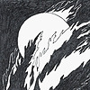
The use of so many layers really gives this an intense atmosphere. It's great!
👍: 0 ⏩: 0

It'd look great as the background of an animated short.
👍: 0 ⏩: 0

Teach me to be great like you.
I'll pay in muffins and pancakes. ):
👍: 0 ⏩: 0

the atmosphere of this image truely captures the neighbors in essence, which you tend to only see a facade and never grasp the depths and complexities of them. that's what i see through the choice in colors, the layering, the composition, and the fading of the bldg into the background.
*_-
👍: 0 ⏩: 0

I like your style a lot, it's quite different from the normal stuff posted here at DA
👍: 0 ⏩: 0

tis very cool - where abouts do you start when you are doing a piece like this? -
👍: 0 ⏩: 1

I usually use a lot of layers on these types of pieces. I map out the basic drawing in ink and build on it with different media.. its a lot of trial and error but it usually works out. If it doesnt I just start over-- but I dont give up too easily so that'd take awhile.
👍: 0 ⏩: 1

cool - thanks! 
👍: 0 ⏩: 0


