HOME | DD
 meltyfase — Golden Boy

#affluence #gold #goldleaf #hair #hairstyle #mohawk #money #oc #punk #purplehair #rich #purplemohawk #richboy #gayboys
Published: 2016-09-12 05:29:10 +0000 UTC; Views: 479; Favourites: 17; Downloads: 0
Redirect to original
Description
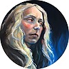
Day 011 "treasure"My OC, Fu Xin
please steal him so he can plague someone else's life dear god
throwing his affluence in my face
like I gave you MY hands, be a little more grateful/
not to be confused with Golden Boy
Related content
Comments: 14

These colors are quite lovely, particularly around the face in the eyes and around the nose. I love the way this is colored -- it's sloppy, but intentionally so, and goes with the sketchier linework. And I freaking love his hair. The colors, the way it flows, and everything about the linework and coloring is stunning in the hair.
His hand seems like it's a touch too big and his wrist most definitely so. It's almost as wide as his throat! Which such a thin neck, I'd expect thinner wrists and forearms. His torso seems a little wide, too. His shirt and it's pattern, and the fact that it's so comparably textureless, make his torso look like a wide line straight across the page. It seems like his chest should cuve gently in right around the start of his wrist. Seems his body is a bit too big for his head. His eyebrows look a bit odd as well. Clearly they're too small, which I assume is intentional, but perhaps having an indication that his eyebrow used to be there would've been a good idea. If you look at people who've shaved their eyebrows, there's usually paler skin under there or they're constantly left with his small shadow of an eyebrow.
I think this could've benefitted from some interesting shading using your cool coloring technique, like right around the ears and jawline. Plus some semblance of a simple background would've been cool, rather than just having your character standing in nothing.
Overall, I love the colors, his expression is so gentle and detailed. His face and the way it's colored caught my attention for good reason. He looks fantastic, in spite of my criticisms. Great work on him! He's a cutie!
👍: 0 ⏩: 1

Thank you so much for critiquing me 
Jus sayin I agree with everything you said Like I can't look at him anymore! I wanna fix it ha
I seem to always draw big hands!!!! *cries
I really like you idea of draw stubble where the eyebrow used to be. When I draw long eyebrows they're usually unruly but for some reason my shaved eyebrow people are so clean and neat. I shave my own brow and they grow back in an instant but I just never thought about doing something like that. I'm actually excited to start doing that now.
I also agree with you on the lighter skin underneath like WHY DID'NT I THINK OF THAT
👍: 0 ⏩: 0

Hello from ProjectComment !
I really love your way of shading: the combination of bright watery color and bold lines is very refreshing.
His expression is like a 'Golden boy' should have: a bit narcissistic and spoiled and yet innocent. There is a problem with his eye though: it is a bit too high and too close to the nose. If you imagine an actual eyeball in his orbit you will see what I mean. It is very subtle, but human face is tricky and does not tolerate even smallest mistakes
Then I'd like to comment on the colors. His T-shirt has some blue, which is nice, but local. By local I mean it does not occur anywhere else and nothing in mixed with it within the T-shirt. Maybe some brown or magenta would help to bring the piece together. the same goes for his brown hair. It is nicely done, but it tis too uniform in terms of color. A bit of blue on the might look nice.
My next point is a general one. It is usually nice to see the structure of whatever object you are painting. In this case his face (however youthful and soft) has some structure to it. Do not be afraid to show the turns of the face by applying more active color (around the orbit, on the cheekbones, on the chin (on the very bottom there should be a reflex and the main turn and the darkest shadow should go roughly along the mandible).
Anyway, I am caviling and I will stop now 
👍: 0 ⏩: 1

I appreciate this critique so much holy moly
I always struggle with how close to put the eye to the bridge of the nose :/
yeah, now that I think about it, putting some magenta in his shirt does make sense to give it more unity color wise.
Like I worked to make sure that his purple looks grown out and faded in some areas but the the brown in his hair? "Nah, I'm just gunna leave that one color cos I don't think"
Shading a face not facing forward literally confuses me so much. Watercolor's also a new(ish) medium for me so I was just scared to do anything to his face lol
I now realize that layering won't kill me.
👍: 0 ⏩: 1

I'm glad I was useful
I myself have almost lost hope to get faces right and (for now) I paint only landscapes.
👍: 0 ⏩: 1

But I really love drawing people so I should really work on painting a realistic face.
I don't do landscapes they really bore me, but I've seen some beautiful ones too.
👍: 0 ⏩: 0

This is so lovely! The expression is really charming, especially with the colour palette you've chosen. Did you use real glitter on the coin?
👍: 0 ⏩: 1

Thank you so much wow
I used gold leaf foil I bought on amazon!
I love that stuff it comes in a cute little jar
👍: 0 ⏩: 0

Adding a little more shading to the side of the coin closest to the boys face will make it look less round, otherwise great job with this piece. Nice choice of colours, they look great!
Projectcomment
👍: 0 ⏩: 1

I agree but I did this with gold leaf and I didn't get gold paints until later to shade it.
but thank you!
👍: 0 ⏩: 1

These colours are just so speechless! I really love them. >A< Awesome drawing!
👍: 0 ⏩: 1

Thank you!
this one took a while
👍: 0 ⏩: 1


